
The Gaps in the Well Woman's Chart Were Not Accidents - And Claude Fable 5 Found Them
What a deep AI research pass found hiding in a guideline everyone trusts

A woman of 45 walks in for her annual visit. She has no idea that the single most important question her clinician could ask her — Are you safe at home? — is not on the preventive-care chart for her age. Except it is. It was just left off the tool that reproduces it.
I have spent 50 years inside obstetrics and gynecology. I trust the WPSI Well-Woman Chart.
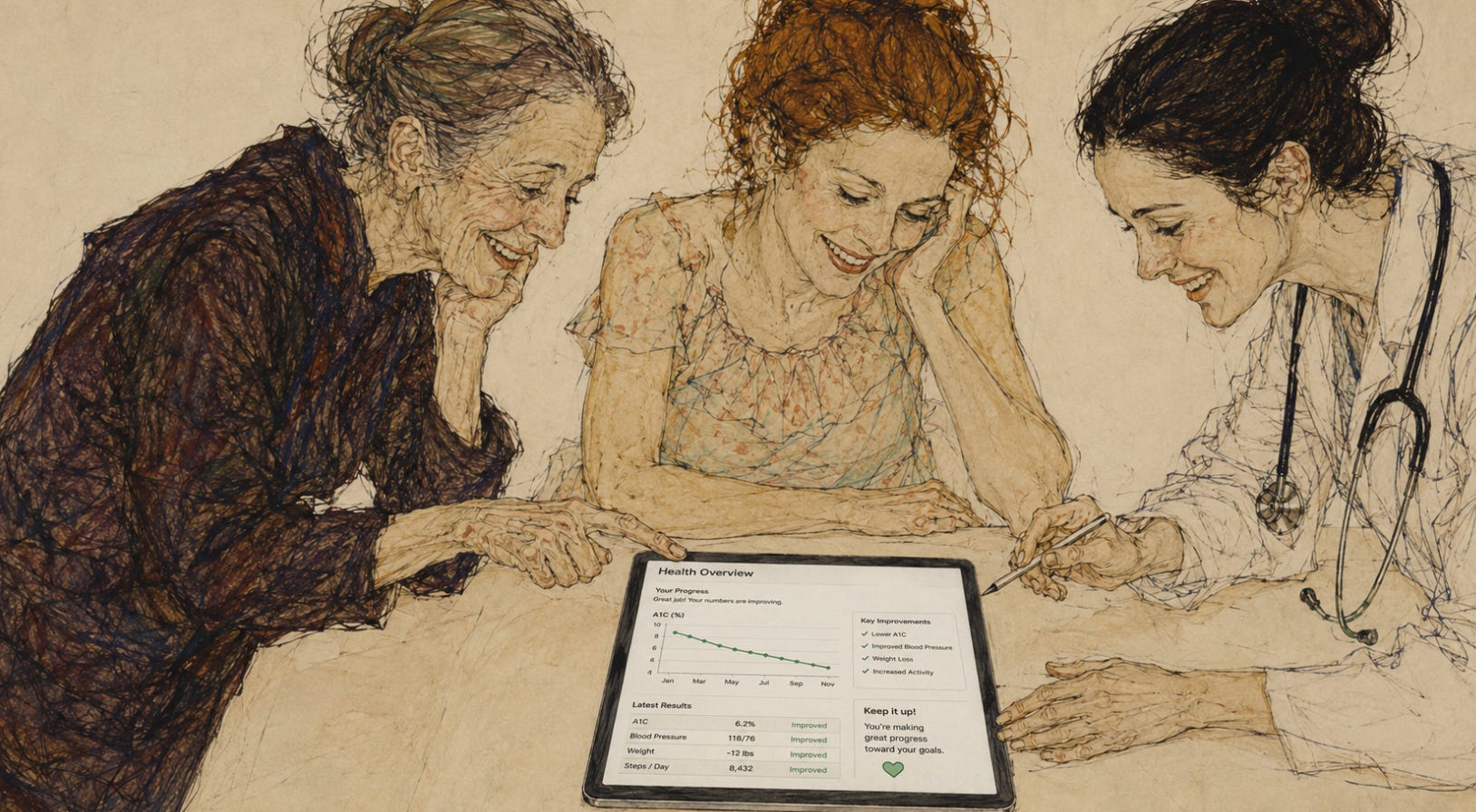
I created an interactive tool for it.
It is a careful, evidence-based summary of what women should be screened for at every age. So when we built an interactive version of it for our readers, I expected to find a clean chart and nothing to argue about.
Then I ran a deep research pass on it with Claude Fable 5 which was just released yesterday.
What it surfaced changed how I think about these charts.
What a deep research pass actually does
People hear “AI” and picture a chatbot guessing. That is not what happened here. I gave the model the chart and one instruction: compare it, line by line, against the published source — the WPSI 2026 PDF, the USPSTF recommendation statements behind it, the Bright Futures schedule it cites, and the ACOG and CDC guidance that sits next to it. Then tell me, for every single item, whether the tool is faithful to the chart, and where the chart itself goes quiet.
It did this without fatigue, without skimming, and without the thing every human reviewer brings to the table after the tenth page: the assumption that the chart is probably fine. It applied the same standard to row one and row forty. That consistency is the whole point. It is also why I have argued for some time that machine review is more even-handed than human review — not smarter, more even-handed.
Here is what it found.
One real error — and it was the one that mattered most
Intimate partner and domestic violence screening is on the WPSI chart for every age band, 13 to over 75, under General Health. Our tool had it only in the pregnancy and postpartum sections.
A non-pregnant 45-year-old would have moved through the entire tool and never seen it.
This is not a small thing. Asking a woman whether she is safe is not a checkbox. It is sometimes the only moment in a year when the question gets asked at all. The research pass caught it in seconds. We fixed it the same afternoon.
And created a tool HERE.
The gaps that were not errors — they were silences
The more interesting finding was not the mistake. It was the pattern of what the chart simply does not say.
The chart references Bright Futures for adolescents — and then buries five real recommendations in a footnote. Suicide-risk screening for teens 13 to 21 is one of them. A teenager using a preventive-care tool should see that on her list, not in fine print. We pulled all five out — suicide risk, vision and hearing, anemia, cardiac risk, fluoride — and put them where a 16-year-old can find them.
Oral health is absent entirely. Not on the chart for adults, barely implied for pregnancy. Yet roughly 40 percent of pregnant women have some form of gum disease, and dental care — including X-rays with shielding and local anesthesia — is safe in pregnancy. Here the research pass earned its keep: it surfaced the association between periodontal disease and preterm birth and the randomized trials showing that treating gum disease does not reduce preterm birth. So we said exactly that. Treat for oral health. Not as a preterm-birth intervention. The honest version, not the hopeful one.
And the prenatal panel was missing items no obstetrician would skip: hepatitis C screening in every pregnancy, and a real maternal-immunization entry — Tdap, influenza, COVID, and the maternal RSV vaccine at 32 to 36 weeks. These are among the highest-value preventive actions in all of obstetrics. The official chart leaves them implied. Implied is not good enough for a patient reading on her phone at night.
The absences worth defending
Some things are left off a chart on purpose, and the silence gets misread. A patient asks for a CA-125 to catch ovarian cancer early. It sounds responsible. It is not — for average-risk women, screening for ovarian cancer does not save lives and leads to unnecessary surgery. The chart’s silence there is correct. But silence teaches nothing.
So we added the deliberate absences as their own entries, each one explaining why it is not recommended: ovarian cancer screening, the routine pelvic exam, hormone therapy for disease prevention — kept carefully separate from hormone therapy to treat symptoms, which is a different and legitimate decision — and daily aspirin, whose guidance reversed while half my older patients kept taking it.
A preventive tool that stays quiet on aspirin leaves them on a regimen the evidence walked away from.
Why I am signing these additions
Every item we added beyond the official chart carries a visible mark: Add-On — AI and Dr. Amos, with a plain note explaining why it is there and where the evidence comes from. Nothing is smuggled in. The reader always knows what is WPSI and what is ours. That is not a disclaimer. It is informed consent applied to a chart.
I did not write this tool by hand and I am not pretending I caught all of this alone. A deep research pass found the gaps; I decided which ones to close and how to word them. That division of labor is the future of clinical content. The machine handles the memory — millions of pages, every footnote, the same scrutiny on every line. The physician handles the judgment — what matters for this patient, what to say, what to leave out, what to stand behind.
The chart was good. It is better now. And it took an afternoon, because the research was deep and the standard never slipped.
The tool is live
You can use the updated Well-Woman tool on ObGyn Intelligence.
Pick patient or clinician detail, choose an age, and watch the Add-Ons appear with their reasons attached. Link in the comments.