

She was 28, healthy, first baby, spontaneous labor. At 5 centimeters, her contractions were strong and regular. The nurse plotted a dot on the partogram. Two hours later, another dot. She had progressed to 5.5 centimeters. The line had crossed the “alert” threshold. An hour after that, the obstetrician recommended a cesarean for “failure to progress.”
Her labor had not failed. The chart had.
For seven decades, a single graphical tool has dictated the pace at which women are expected to dilate, when doctors should intervene, and when a labor gets labeled “abnormal.” That tool is the partogram. And the curve it was built on was drawn by hand, by one resident, on one night, from observations of 100 women.
It is time to understand what a partogram actually is, what it can and cannot tell you, and why the original curve that defined “normal” labor was neither normal nor accurate.
What the Word Means
The word partograph is a hybrid. It combines the Latin parere, meaning “to give birth,” with the Greek graphein, meaning “to write” or “to record.” A partogram (using the Greek suffix -gramma, meaning “something written or drawn”) is the document itself. In practice, the two terms are used interchangeably.
The literal meaning: a written record of birth. aka labor curve.
That sounds straightforward. But what gets written, and the lines drawn on that record to define “normal,” have shaped obstetric practice more profoundly than almost any clinical trial.
What a Partogram/Partograph Actually Is
A partogram is a pre-printed, single-page form used during labor. It provides a graphical record of key observations plotted against time. On most versions, the chart tracks:
Fetal condition: heart rate, color of amniotic fluid, molding of the fetal skull.
Maternal condition: pulse, blood pressure, temperature, urine output.
Labor progress: cervical dilation (in centimeters), descent of the baby’s head (measured as “station”), and the frequency and duration of contractions.
The centerpiece of the partogram is a graph where cervical dilation is plotted on the vertical axis and time on the horizontal axis. As labor progresses and the cervix opens, dots are placed on the chart. The pattern those dots form is compared against reference lines to determine whether labor is progressing “normally.”
Two critical lines appear on the traditional partogram. The alert line represents the slowest acceptable rate of progress. If a woman’s dilation curve crosses this line, it signals that labor may be slower than expected. The action line, placed two to four hours to the right of the alert line, signals that intervention should be considered.
The question that matters: who decided where those lines go?
The Stages and Phases of Labor
Before understanding the partogram’s controversies, you need to understand what it is supposed to track.
Labor is divided into three stages.
The first stage begins with the onset of regular contractions and ends when the cervix is fully dilated at 10 centimeters. This is the longest stage, and it is subdivided into two phases.
The latent phase is early labor. Contractions are becoming regular, and the cervix is slowly thinning (effacing) and beginning to open. Progress during this phase is slow and variable. Some women spend hours in latent labor. Others barely notice it. In the traditional framework, the latent phase extends from 0 to about 3 or 4 centimeters.
The active phase is when things are supposed to accelerate. Contractions become stronger, longer, and closer together. The cervix dilates more rapidly. Traditionally, the active phase was thought to begin at about 4 centimeters of dilation. Modern evidence suggests it may not truly begin until 6 centimeters.
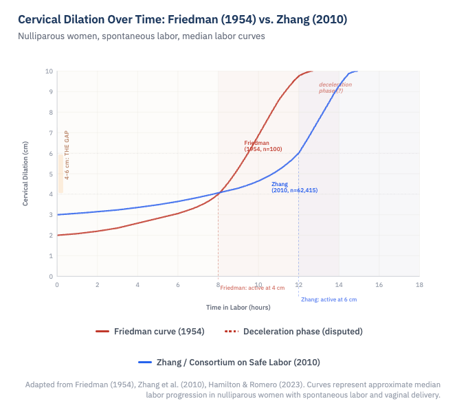
The deceleration phase was Friedman's term for a supposed slowing of cervical dilation in the final centimeters before full dilation, as if the cervix shifted gears and opened more gradually from about 8 or 9 centimeters to 10. The Consortium data showed no such phase at the end of the first stage.
The second stage begins at full dilation (10 centimeters) and ends with the birth of the baby. This is the pushing stage.
The third stage begins after the baby is born and ends with delivery of the placenta.
The partogram focuses almost entirely on the first stage, particularly the active phase. And the expectations for how fast that phase should progress were, for over half a century, defined by one man’s observations.
The Friedman Curve: One Night, One Resident, One Curve
In 1954, Emanuel Friedman was a young obstetric resident at Columbia University in New Tork. Dr. Virginia Apgar, the attending anesthesiologist (and creator of the Apgar score), asked him to study the effect of caudal anesthesia on labor. Friedman spent a night recording cervical dilation and fetal station measurements on a series of laboring women.
By morning, he had plotted their cervical dilation against time and observed that the resulting graph formed an S-shaped (sigmoid) curve. He published his findings based on observations of approximately 100 women, and the “Friedman curve” was born.
From these initial observations, Friedman described the first stage of labor as having distinct components: a latent phase, an acceleration phase, a phase of maximum slope (the steepest part of the active phase), and a deceleration phase near the end, as the cervix approached full dilation.
He established benchmarks that became gospel. The active phase was said to begin at 4 centimeters. The minimum acceptable rate of cervical dilation in the active phase was 1.2 centimeters per hour for first-time mothers and 1.5 centimeters per hour for women who had given birth before. The 95th percentile for the duration of the latent phase was 20 hours for first-time mothers and 14 hours for experienced mothers.
These numbers shaped textbooks, training programs, and clinical protocols worldwide. They became the basis for the alert and action lines on partograms. They defined when a labor was “too slow.” And for decades, labors that did not meet these benchmarks were labeled as having “protraction” or “arrest” disorders, often leading to interventions including cesarean delivery.
There was one significant problem. Friedman drew the original curve by hand. No modern statistical model was used. And the curve he described, particularly the deceleration phase near full dilation, may never have existed at all.
Where the Curve Went Wrong
In 2002 and then more definitively in 2010, Dr. Jun Zhang and colleagues from the Consortium on Safe Labor examined labor patterns in a dramatically larger dataset: over 62,000 women across 19 hospitals in the United States, all of whom had spontaneous labor, vertex presentation, and normal neonatal outcomes.
Their findings contradicted Friedman’s curve in several critical ways.
The active phase starts later than 4 centimeters. Zhang’s data showed that the transition from latent to active labor occurred at approximately 6 centimeters, not 4 centimeters. Before 6 centimeters, labor progressed slowly for both first-time and experienced mothers at a similar rate.
Normal labor is much slower than Friedman described. The 95th percentile for progression from 4 to 5 centimeters was over 6 hours. From 5 to 6 centimeters, it could take more than 3 hours. These durations would have triggered “failure to progress” under Friedman’s criteria, yet these women all delivered vaginally with healthy babies.
The deceleration phase probably does not exist. The Consortium data showed no deceleration phase at the end of the first stage. This was a significant finding. Forcing a deceleration phase into the model, as Friedman had done, artificially steepened the curve in the active phase, making the expected rate of dilation between 4 and 6 centimeters faster than it actually is for most women.
Labor progress is not one-size-fits-all. Subsequent studies have shown that labor curves are affected by maternal obesity, age, hypertension, gestational age, fetal size, and even fetal sex. A single curve cannot represent the enormous variability in how individual women labor.
The implications were staggering. For decades, the 1 centimeter per hour rule had been applied starting at 4 centimeters. Women who were in what we now understand to be the normal latent phase were being treated as though they were in active labor and falling behind. They were being augmented with oxytocin, subjected to amniotomy, and delivered by cesarean, not because their labors were abnormal, but because the standard against which they were measured was wrong.
What ACOG Changed
In response to this evidence, the American College of Obstetricians and Gynecologists issued updated guidance. The most recent Clinical Practice Guideline, published in January 2024, makes several key recommendations.
The active phase of labor should be defined as beginning at 6 centimeters of dilation, not 4 centimeters.
Active phase arrest should not be diagnosed before 6 centimeters. After 6 centimeters, arrest requires no cervical change despite ruptured membranes and either 4 hours of adequate contractions or 6 hours of oxytocin augmentation with inadequate contractions.
A protracted active phase can be conservatively defined as less than 1 centimeter of cervical change in 2 hours.
The latent phase has wide normal variation and, by itself, slow progress in the latent phase is not an indication for cesarean delivery.
These changes represent a fundamental shift. The question is no longer simply “is this labor following the Friedman curve?” It is “does the evidence support intervening at this point?”
The WHO Moves On
In 2020, the World Health Organization took the next step. After decades of recommending the traditional partograph with alert and action lines based on the 1 centimeter per hour rule, the WHO launched the Labour Care Guide (LCG), a redesigned monitoring tool intended to replace the classic partogram.
The LCG defines active labor as beginning at 5 centimeters of dilation. It sets the minimum acceptable rate of dilation at 0.5 centimeters per hour rather than 1 centimeter per hour. It removes the alert and action lines entirely. And it adds sections for supportive care, shared decision-making, and respectful maternity care, elements that no partogram ever included.
A 2024 pilot trial in India published in Nature Medicine provided preliminary evidence that the LCG may help reduce unnecessary cesarean deliveries when combined with implementation support and provider training.
The shift from partograph to LCG is not just a technical update. It is a philosophical one. The traditional partograph asked: is this labor keeping pace with a predetermined curve? The Labour Care Guide asks: are this mother and this baby safe, and is progress being made?
What You Should Know
If you are pregnant or planning to be, here is what this means for you.
There is no universal clock on labor. Progress from 4 to 6 centimeters can be very slow and still be completely normal. If you are told your labor is “stalled” before you reach 6 centimeters, ask what criteria are being used to make that determination.
“Failure to progress” is the single most common reason for a first cesarean in the United States. Many of these diagnoses may have been based on outdated expectations. Ask your provider whether they use the updated ACOG definitions for active phase arrest.
The partogram is a monitoring tool, not a decision-making tool. No labor should be managed by lines on a chart alone. Clinical decisions should incorporate the whole picture: fetal heart rate patterns, maternal well-being, the position and descent of the baby, and the pattern of change over time.
Ask your team what standard they follow. The Friedman curve placed the start of active labor at 4 centimeters and demanded 1.2 centimeters per hour. Modern evidence places active labor at 6 centimeters with much wider variation in acceptable dilation rates. These are not small differences. They determine when your labor gets called “abnormal.”
A written record of birth should describe what is happening. It should not prescribe what must happen, or how fast. For too long, a hand-drawn curve from 1954 did exactly that. The evidence now tells a different story, and it is one that trusts women’s bodies more than any line on a chart.
References
Friedman EA. The graphic analysis of labor. Am J Obstet Gynecol. 1954;68(6):1568-75.
Friedman EA. Primigravid labor: a graphicostatistical analysis. Obstet Gynecol. 1955;6(6):567-89.
Zhang J, Landy HJ, Branch DW, et al. Contemporary patterns of spontaneous labor with normal neonatal outcomes. Obstet Gynecol. 2010;116(6):1281-87.
Zhang J, Troendle JF, Yancey MK. Reassessing the labor curve in nulliparous women. Am J Obstet Gynecol. 2002;187(4):824-28.
Hamilton EF, Romero R. The evolution of the labor curve and its implications for clinical practice. Am J Obstet Gynecol. 2023;228(5 Suppl):S1050-S1062.
First and Second Stage Labor Management. ACOG Clinical Practice Guideline No. 8. Obstet Gynecol. 2024;143(1):144-62.
Philpott RH, Castle WM. Cervicographs in the management of labour in primigravidae. J Obstet Gynaecol Br Commonw. 1972;79:592-98.
Oladapo OT, Diaz V, Bonet M, et al. Cervical dilatation patterns of ‘low-risk’ women with spontaneous labour and normal perinatal outcomes: a systematic review. BJOG. 2018;125(8):944-54.
Vogel JP, Pujar Y, Vernekar SS, et al. Effects of the WHO labour care guide on cesarean section in India: a pragmatic, stepped-wedge, cluster-randomized pilot trial. Nat Med. 2024;30:463-69.
WHO Labour Care Guide: User’s Manual. World Health Organization; 2020.
Lavender T, Cuthbert A, Smyth RM. Effect of partograph use on outcomes for women in spontaneous labour at term and their babies. Cochrane Database Syst Rev. 2018;(8):CD005461.
Ubom AE, et al. FIGO position statement on the use of the WHO labor care guide versus the partograph. Int J Gynecol Obstet. 2025.